Hardrock: A Modern Sans Serif Font for Digital Design
As a UI designer who ships dozens of landing pages, SaaS dashboards, and e-commerce experiences each year, I pay close attention to how typography shapes perception—before users even read the first word. Hardrock stands out not because it shouts, but because it delivers quiet confidence: clean lines, balanced proportions, and subtle geometric warmth that translate seamlessly across screens, devices, and contexts.
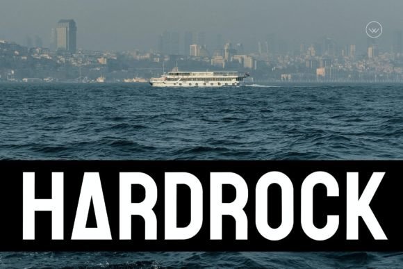
Hardrock is a contemporary sans serif font built for digital clarity. Its letterforms avoid extreme contrast or exaggerated terminals, striking a balance between friendliness and authority. The x-height is generous without crowding, counters are open, and spacing feels intuitive—even at small sizes. That’s why it works so well in real-world web design: as a hero headline on a product page, a crisp CTA button on a mobile-optimized checkout flow, or a consistent header across a multi-page course platform.
Where Hardrock Excels in Web Layouts
Hardrock thrives where visual hierarchy meets functional intent. In hero sections, its strong uppercase presence commands attention without sacrificing legibility—especially against bold gradients or subtle image overlays. On landing pages, I use it for primary headings and subheads, then pair it with a neutral, highly readable sans serif (like Inter or Open Sans) for body copy. This creates clear typographic rhythm: Hardrock sets tone and intention; the supporting font handles endurance and scanning.
For online stores, Hardrock adds polish to banners, category headers, and limited-time offer tags. Its modern sensibility aligns well with boutique brands, creative agencies, and wellness startups—where professionalism shouldn’t feel sterile. I’ve used it for logo lockups in brand kits, too: its sturdy ‘R’, balanced ‘A’, and confident ‘K’ hold up beautifully at small sizes, whether rendered in SVG or embedded as variable font CSS.
Readability Across Devices and Contexts
On mobile, Hardrock performs reliably down to 16px for short labels and 20px for section headings—provided line height stays at 1.4–1.5 and letter spacing is adjusted slightly (+0.25px for all-caps usage). It renders cleanly on both light and dark backgrounds, though I recommend testing contrast ratios: its medium weight hits WCAG AA compliance easily against #1a1a1a on white, and #f8f9fa on charcoal. Over photography or video backgrounds, a subtle text shadow or semi-transparent overlay ensures readability without compromising aesthetic cohesion.
For buttons and interactive elements, Hardrock’s medium and bold weights deliver excellent clickability cues. Rounded corners on UI components pair naturally with its soft geometry—no jarring stylistic clash. Just avoid ultra-thin or extra-light variants for interface text; they’re better reserved for decorative accents or print collateral.
Smart Pairing and Practical Typography Strategy
Hardrock isn’t meant to carry every typographic role alone. Think of it as your brand’s “voice”—distinctive and memorable—but rely on a versatile companion for sustained reading. For editorial or blog layouts, I often pair it with a warm serif font like Merriweather or Lora for body copy. That contrast signals structure: Hardrock introduces ideas; the serif invites deeper engagement. For tech or productivity tools, a monospaced or neo-grotesque sans serif (e.g., IBM Plex Mono or Manrope) provides useful functional contrast in code snippets, tables, or status indicators.
It also works elegantly alongside restrained script fonts or minimalist handwritten fonts for accent phrases—think “Handcrafted” beneath a product title or “Free Guide” beside a download button. The key is restraint: one display font per layout, used intentionally.
Licensing, Formats, and Real-World Implementation
Before deploying Hardrock in client work or live products, verify licensing scope. Most premium fonts include webfont files (WOFF2 recommended), desktop use, and embedding rights for SaaS platforms—but always confirm whether your license covers e-commerce templates, digital ad assets, or white-labeled dashboards. Some versions include stylistic alternates, small caps, or multilingual support (Latin Extended-A, Greek, Cyrillic)—critical if your audience spans EU or APAC markets.
Technically, Hardrock integrates smoothly via CSS @font-face or font hosting services. If using variable font files, leverage axis controls for optical sizing or subtle weight shifts on hover states—small details that elevate perceived polish. And yes, it supports OpenType features like ligatures and contextual alternates, though I reserve those for hero graphics or branded PDFs rather than dynamic web content.
Designing Identity, Not Just Interfaces
What makes Hardrock more than just another modern typography option is how consistently it reinforces brand tone. A coaching website gains approachability without losing credibility. A creative portfolio feels curated, not chaotic. An online store communicates quality before the first product image loads. That’s the power of intentional typeface selection—not decoration, but communication infrastructure.
In practice, I treat Hardrock as a foundational design asset: part of the brand kit, referenced in Figma tokens, documented in style guides, and tested across OS-level rendering engines. It doesn’t solve every problem—but when paired with thoughtful spacing, color, and interaction design, it helps users trust what they see, understand what they need to do, and remember who delivered it.
If you're refining a digital brand identity, launching a new online store, or rebuilding a high-conversion landing page, Hardrock offers a rare blend: distinctive enough to stand out, neutral enough to scale, and technically sound enough to ship with confidence.